
Alert! Top User Frustrations on the Web
What are the most frustrating things you faced today in the website’s UI? Tiny unnoticeable things are very disappointing for users. The famous author Vitaly Friedman of Smashing Magazine summarized all key user frustrations you might have missed in your website’s UI, resulting in a bad user experience.
In this article, we were hoping you could overview the top most critical frustrations and share tips on how to resolve them.
Text too small

Grab your glasses, as the text is too small! How frustrating!! Do you read small text content or skip it??
Well, now you know what we are talking about! The small text makes us feel like a 92-year-old granny holding a newspaper up to her face to read. Small text for web content is a “BIG NO”!
How can we resolve this issue?
- For an ideal website, the minimum font size should be 16 pixels. Sixteen pixels for body content text is a good start. Remember, “bigger the screen, larger the text”.
- Tell your web designer to aim for line height 1.5 em or 1.6 em for optional readability.
- The PRO TIP constantly tests the website on the actual device for which it is designed.
Tiny clickable elements
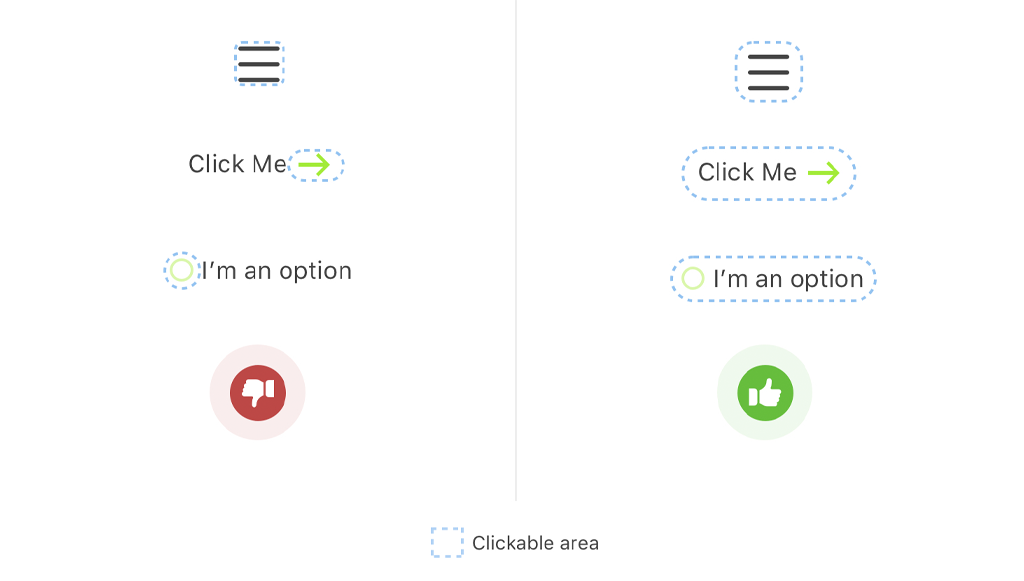
The smaller the interactive elements (links, buttons, and other UI controls), the more frustrating it makes the user while interacting with your website. For example, once a user was on a shopping website looking for some stuff to buy. After successfully adding stuff to the cart, when he targeted the ‘buy’ button, he was frustrated with its tiny button size. After a long struggle, he could order, swearing to himself that he will never revisit this site.
Consider this as an issue for your website, and in case your website also have a similar problem. Change it right away, as it is not attractive at all.
“Do not play ‘FIND THE BUTTON’ with your website visitors.”
How to resolve this issue?
- Make sure all clickable buttons on your website are finger-friendly. The average size should be 9mmX9mm, and website companies should keep the size of touch targets 48X48px.
- Add 10 mm padding between touch elements as per Microsoft guidelines.
Scroll hijacking

Automating scrolling is one of the most frustrating UI design trends from a user point of view. It’s a pint-sized possibility that few offshore designers might create good scroll jacking-based UI designs. But users don’t like this trend. What is scroll hijacking,g exactly?
Scroll hijacking is an interface design that allows websites to control how you scroll down a web page.
For e.g., scroller movers automatically run animations instead of scrolling down a page.
Users generally don’t like “keep scrolling” instructions and a website to mess with scroll rate.
How to resolve this issue?
- Use a proper layout if you are planning to use scroll-hijacking on your website.
- Find a balanced approach that makes content justified and in the form of individual slides or elements.
Boy! This autoplay video with sound is quite embarrassing.
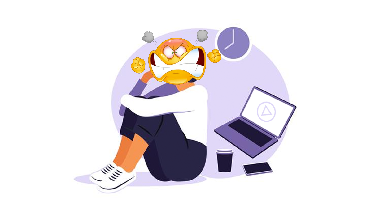
You must have experienced this several times! What happens is the user arrives at a page and doesn’t expect the audio content to start playing without consent. Chances are users might leave the website without looking further. Those who plan to stay will put extra effort into reducing the volume or hunting for the mute button.
It is fine to use autoplay videos, but ensure it is muted by default.
How to resolve this issue?
Set the audio off by default with the option to turn it ON.
Oh, no! Did I just click on the ad button again!!
It is very frustrating when you arrive on a website with too many popups, and every time you try to do something productive, you end up getting on the popup window most of the time. If you hire developers from India, GKMIT, the chances of such clustered and untidy video is zero, and you can have the best sense of website and web app development. If somehow you landed on such websites, then chances are you contribute to the top user frustration list and need to work on it ASAP. There is another thing that needs to be considered is the ‘content shift’. E.g. if you are trying to click cancel and end up buying.
How to resolve this issue?
- Get in touch with a qualified designing company to avoid popups.
- Try measuring the height of dynamic content to avoid content shifting. Hardcode it as min-height for the container in CSS.
Why isn’t this back button working?
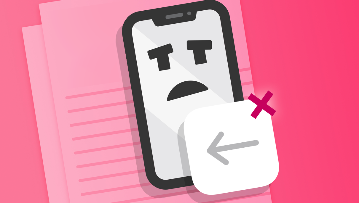
The frustration level is OP when the back button on a web page does not function.
According to famous usability consultant Jacob Nielson
“Users need a clearly marked emergency exit to leave the unwanted pages without having to go through an extended process.”
Here, the emergency exit is the back button, but wait, what when a user accidentally clicks on the back button and does not want to leave the data-filled page and fear losing data or rewriting data as discussed in a point below ‘data loss on errors’.
Well, there is a huge possibility that this situation is real. So when you are looking for web designers, what you can ask for in your upcoming web development project?
How to resolve this issue?
- Ensure the back button is functioning on every page.
- If the page is a form, then give a warning before going back.
- Permission to store cookies
Cookies are basic tools that store personal details and allow owners to track his/her online activity. Thus GDPR requires cookie compliance. GDPR (General Data Protection Regulation) is a legal framework that sets guidelines for collecting personal data from individuals who live in the European Union. Some websites show a modal window right at the start to accept cookies usage. They block visitors until they accept or leave the website.
How to resolve this issue?
Some websites give users a polite solution. They show how cookies are used and give freedom of choice, whether they want to allow only necessary cookies or all cookies.
Data loss on errors
You might have witnessed this scenario when you filled a form, and as you click submit, the page reloads, and you lose all the forms’ data with an error message on top. How frustrating it is!!’
This happened several times with us, and trust us, we really tackled this frustration smartly.
How to resolve this issue?
- To store key-value pairs, try local storage and session storage.
- Pre-fill data into relevant fields already provided by users in their previous visit.
That’s all, folks!
We come towards the end of the blog and hope we didn’t make it to the top user frustration list ;).
The above point might have helped you understand the basic features, which are the key to user frustration and how to handle it effectively. Try to keep track of your user’s online behaviour, analyze and find ways to improve.
It sounds like too much work! Well, here is another pro tip for you. Get in touch with the best web developers in India, GKMIT, and we will take care of the rest. We hope you enjoyed reading this blog and found things relatable. If you have any suggestions, please let us know in the comment.
Happy reading!
Related Blogs –
Top Tips To Create Engaging And Useful Chatbot
What Is Natural Language Processing Introduction To Nlp
Remote Work In The It Industry List Of Benefits And Best Practices
Staff Augmentation For The Internet Of Things